This Designer Mom Dreamt Up a Nursery That Also Serves as an Office and Guest Space
For many parents living in small spaces, the arrival of a baby means playing a game of musical chairs with the available rooms in the house. And the spare room in interior designer and consultant Cate St. Hill’s London flat had already undergone a few remixes from a guest room to an office for one, then an office for two during lockdown. Now it needed to transform to accommodate the family’s growing needs once more. “I was a little sad because I was going to lose my workspace and, in the words of Virginia Woolf, a room of one’s own,” St. Hill shares. “It just felt like another sacrifice women have to make. But I also couldn’t wait to get nesting and create a gorgeous room for our new baby.”
This was St. Hill’s first shot at decorating a child’s space, but she had a solid game plan. First, she moved her desk to the main bedroom, then reconfigured the empty spare room to pull triple duty as a nursery, guest quarters, and workstation for her husband, relying on a number of budget-friendly tricks to fashion a zen-inducing, Scandi-chic spot.
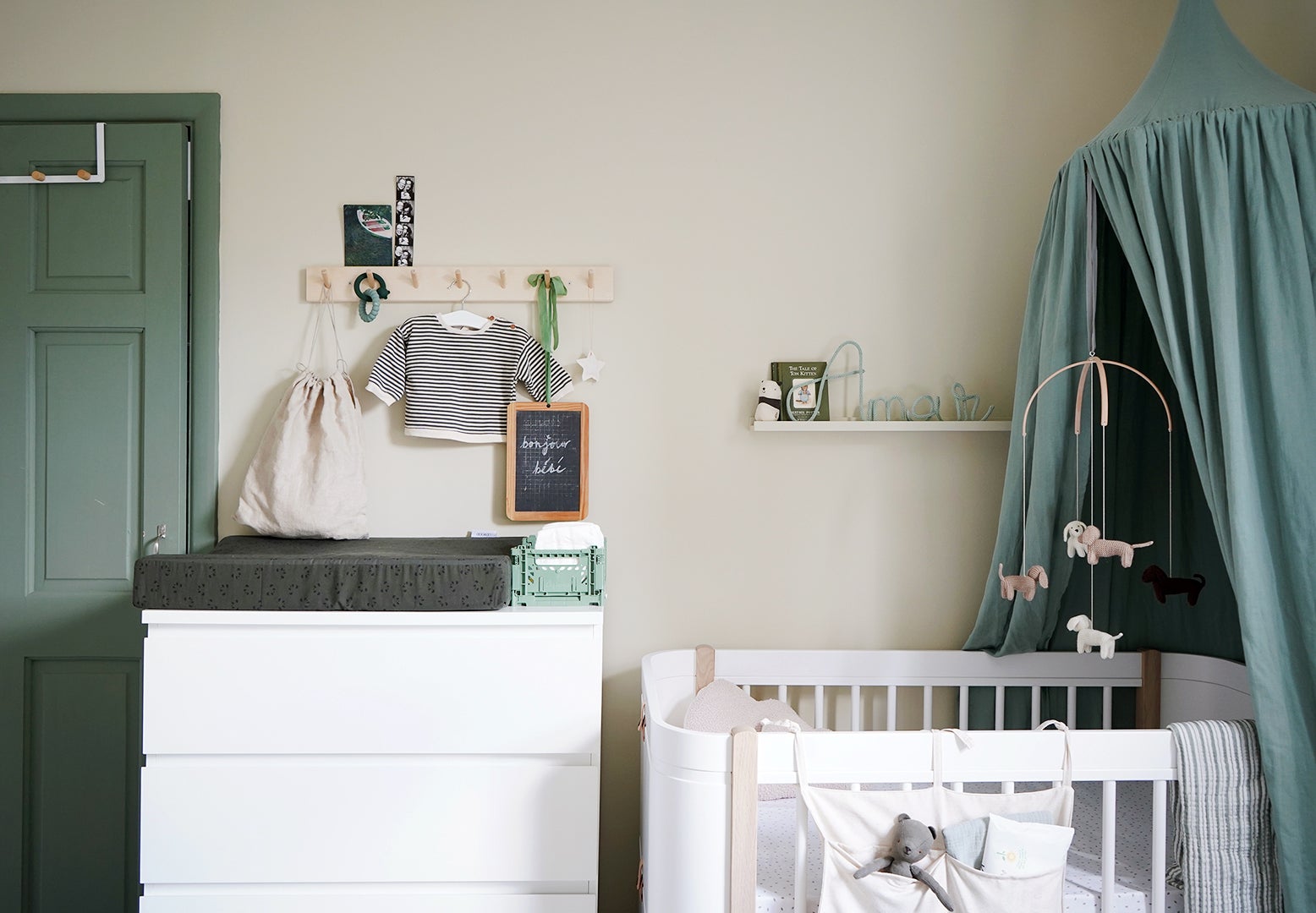
The north-facing room’s existing walls—clad in Farrow & Ball’s Lamp Room Gray—now seemed too dim and cold for a baby. For most people, selecting a new paint color is overwhelming, but St. Hill goes by a simple rule of thumb: the 70:20:10 ratio. According to her, “70 percent of the room should be your background color, 20 percent a complementary color, and 10 percent your accent color.” To counterbalance the cool natural light coming through the only window, St. Hill coated the walls in Beige 01 by Lick, a sunny caramel with slight yellow and gray undertones. She chose Lick’s Green 02 as the accent hue on the door, window frame, baseboards, and even the radiator—a natural decision considering other spaces in her home (like her bedroom and living room) are dotted with the same soothing shade.
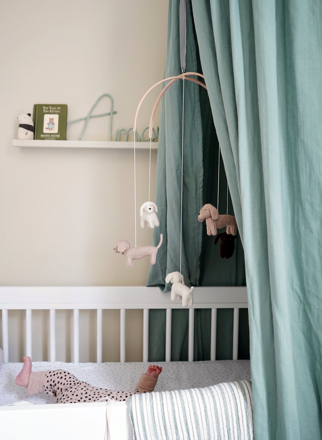
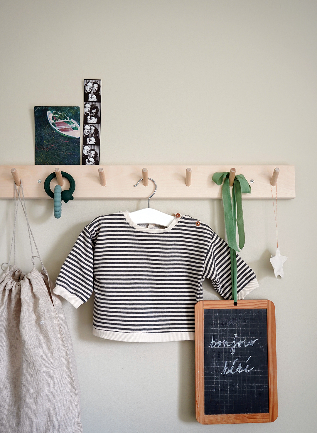
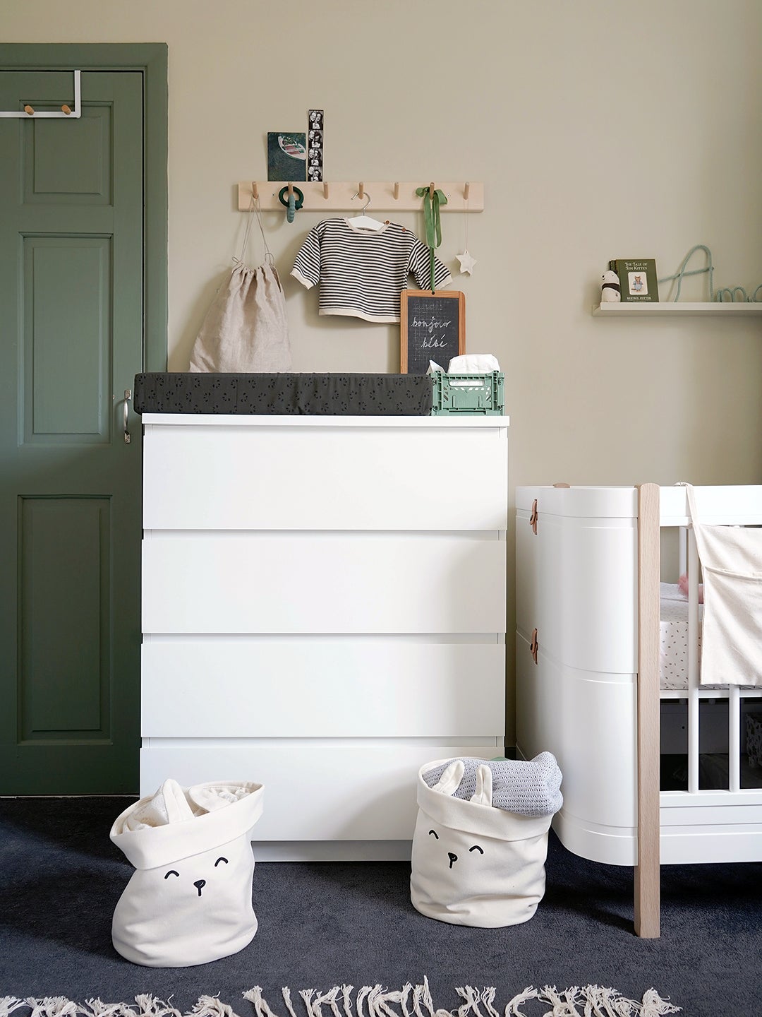
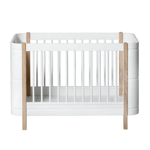
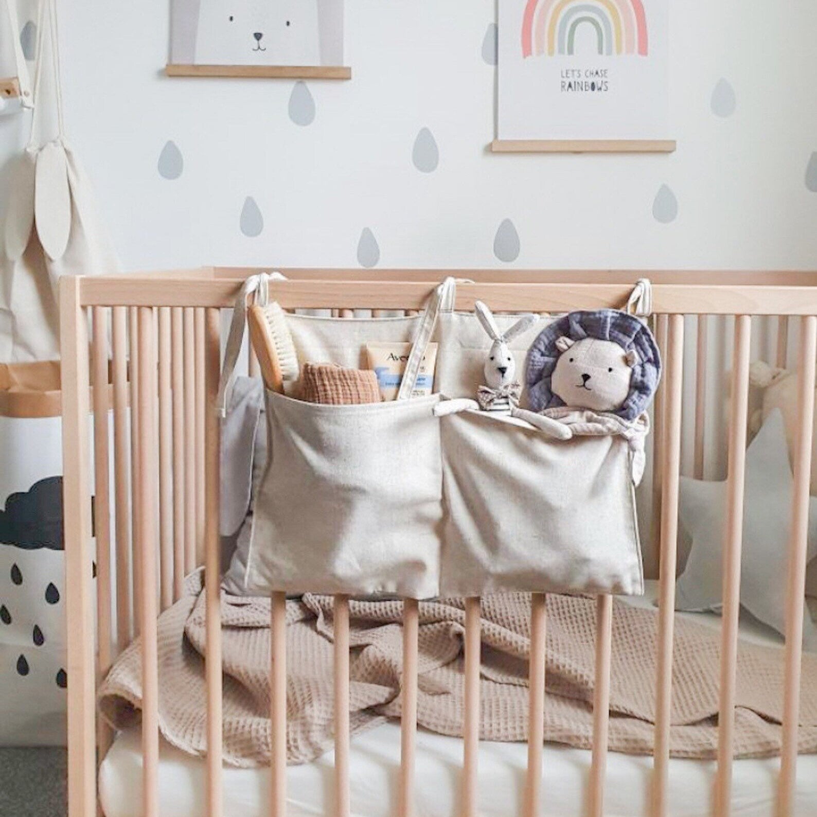
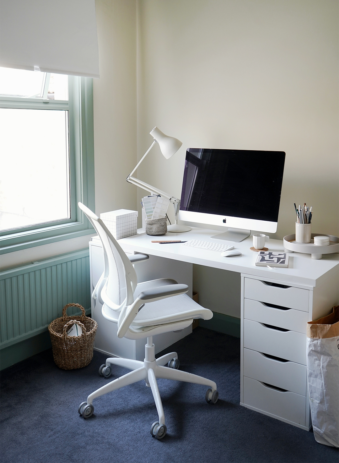
The complementary color—white—came in the form of furnishings, both new and old. Like the room itself, most have to serve multiple purposes: An IKEA Malm dresser that was previously in the main bedroom became a changing table, while the crib is adorned not only with a green canopy and a sausage-dog mobile (a nod to the residence’s ruler of the roost, Francis), but a tie-on organizer that keeps rattles and toys in reach. Even her husband’s work corner is minimalist so that it doesn’t stand out from the rest of the room. Everything is neutral, from the office chair and task lamp down to the pencil cup.
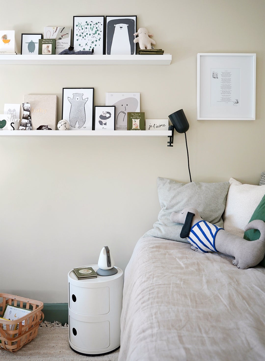
On the other side of the room, a day bed (also IKEA) takes the place of a glider for feeds and cuddles and easily turns into a spot for overnight guests. As the first thing you see, the vignette sets the tone for the rest of the space with comfy linen cushions and a sleek Kartell Componibili side table that doubles as another storage unit (a Facebook Marketplace score). Another one of St. Hill’s easy tricks for staying organized without sacrificing visual calm? Using the full height of the room with slim hanging shelves. These ones previously served as St. Hill’s highly Instagrammable inspiration/mood board, but now display books, art, and sentimental keepsakes, like the designer’s childhood Peter Rabbit books and cards from friends and family welcoming the new addition. A framed poem from Winnie-the-Pooh, however, gets its own place on the wall—St. Hill’s best friend read it at her wedding.
So how did St. Hill do on her nursery design challenge? She reports that her daughter Ophelia is jumping over all the daybed cushions and pulling out all her books while her husband is just happy to have his own desk. “It isn’t ideal having a baby and an office in the same room, but it’s simply what has to work in small homes nowadays,” she accepts. “The secret is creating adaptable spaces that can change and evolve with you.”
The post This Designer Mom Dreamt Up a Nursery That Also Serves as an Office and Guest Space appeared first on domino.

